
I always thought that the best font to study whether for your own notes or for your study material is the easiest one to read. I was quite surprised when I learned that this is not true.
So what is the best font for study notes? The best font for studying and taking study notes is a harder to read, unfamiliar font researches have shown. Using Comic Sans MS, Bodoni MT, Monotype Corsiva, Haettenschweiler or Comic Sans Italicized significantly improved the student’s performance because they were forced to think harder about the material.
This was very surprising to me but the explanation below makes sense. But how about font-size? And is there a difference between online and print fonts?
Why harder to read fonts are better for your study
Let’s take a look at 2 studies that were conducted by psychologists at Princeton and Indiana universities.
Round 1
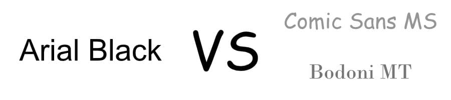
The first study asked 28 students to try to remember the features of 3 alien species in 90 seconds. 14 participants got the material in a black 16-point Arial font while the other had to go through a text presented in more difficult and unfamiliar font Comic Sans MS and Bodoni MT, grey 12 points. The surprising result was that the “harder to read font” group answered with 86.5% questions correctly while the control group with the Arial font only remembered 72.8% of the alien features.
Round 2
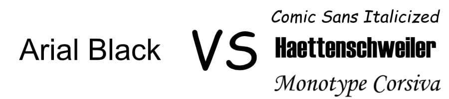
This much larger research took 222 students and half of them received English, history and science material in Comic Sans Italicized, Haettenschweiler or Monotype Corsiva. The result confirmed the findings from the first test. Those students with unusual fonts did much better in their exams than the easy font learners. Between the 3 harder to read fonts no significant difference could be measured.
But why is that? When you think about it it makes perfect sense. If a font is harder to read you can not just quickly skim over it. To understand the meaning the unfluent font forces the learner to pay more attention to the words and their meaning. According to the researchers, a familiar and easy to read font suggests familiarity to the brain which encourages us to assume we know the material presented to us already. And so the saying goes:
Difficulty builds mental muscle, while ease often builds only confidence
What is the easiest to read font?
When you study it is not always the best to have everything in a harder to read font. If your study includes news, background stories or another non-essential accompanying material an easy to read font is the better choice. Most newspapers and publishers use serif fonts like Garamond and Times New Roman. Serif fonts are the ones with tiny little strokes and extras at the edges of the characters. Examples for popular sans-serif fonts (sans means without) are Arial or Courier. A couple of years ago these types of fonts were much more legible when it came to online publications because the screen resolutions of devices back then were not capable of displaying the little serifs. In times of retina displays and ever-improving screens, the readability advantage of sans-serif fonts slowly disappears. Still, according to a study from 1986 participants who had to read a text in Garamond (serif), Times New Roman (serif) and Helvetica (sans-serif) showed huge differences in the comprehension of the material. Garamond readers won by far with 66% followed by Times New Roman with 31.5% and the Helvetica readers came in last with only 12.5%. So there is a reason while Garamond is one of the most popular fonts in print media.
Nothing beats your own handwriting
When writing down your notes a piece of paper and a pen is still the way to go. The process of moving your hand and actually “doing” something with the material increases your retention rate. You still can type and order those notes later as part of a revision for archiving purposes or in case you would like to sell them (take a look at my article on how to do that). And since we are talking about handwriting let me answer another question that was asked very often:
Which is the best pen for taking notes? (and in rare occasions exams, they are all computerized nowadays). I picked a Lamy steel pen first and foremost because of its slim stainless steel design. A pen is (at least for me) a personal thing and knowing I am writing with my favorite pen gives me confidence (I signed my resignation letter with it when I decided to quit my job and start freelancing – never forget that moment). Bonus, it prevents you from chewing on it and is very affordable – here is the Amazon link if you are interested.
What is the best font for older people?
When you are getting older all kinds of fonts get much harder to read. Most of us just might increase the font size or use a reading aid. I am committed to being a lifelong learner so I wondered what to be aware of when I am getting older. There are certain characteristics of a font to consider when your eyesight is decreasing.
- Especially when the eyes cannot focus that good anymore a font with an equal stroke weight is the best way to go
- The height of lowercase letters compared to the height of capital letters (also called the x-height) should be high so that the lowercase letters are larger
- Script fonts or other fonts with special effects that draw attention to the font itself rather than the content should be avoided.
- Fonts that are too condensed or too extended impair readability
- Sans-serif fonts are to be preferred when getting older especially on electronic devices which can decrease readability because of their resolution for serif fonts.
- The text itself should have a high contrast (70%+)
The fonts that meet the criteria above are the usual suspects like Helvetica, Arial, Futura, Gill Sans.
While you are here, why not improve the font color or desk color as well? Check out my article about the best color for studying.
Related questions
What is the best font for a cheat sheet? The best font for a cheat-sheet is a serif font like Garamond (not smaller than 5pt). The reason for this is that a smooth serif font helps you skim over the material when you use the cheat sheet during
2 thoughts on “These are the Best Totally Unexpected Fonts for Study Notes”